Showing posts with label DP2. Show all posts

Monday, 12 March 2012

3D Virtual Environment

Throughout my animation project I have had mixed feelings about my decision to follow this pathway in my second year of university. The tedium of sitting at a computer screen for hours on end has been difficult to cope with, waiting several hours for my final work to render and having headaches and eyestrain took their toll, but through all this my work is finished. 60 seconds of animation having a camera fly around a 3D environment, an envrionment I have made and although with its rough edges and little issues it still is something I can say I am proud of.

At the start of this project after the first lecture I knew this is what I wanted to do. I was happy to wait hours for my animation to render, not like with a film, and would sit at a computer screen all day modelling and animating, not noticing the time pass, whilst constantly watching the clock during the coding of a website.

The project itself has been a great learning experience for me, helping me get to grips with the basics of 3Ds Max as well as probe into some of the more complex tools it has to offer. I feel that the models I produced are of a low quality with simplistic extrudes and bevels done for the majority of it, however after adding my textures to them I saw an instant transformation in the look and feel of my scene.

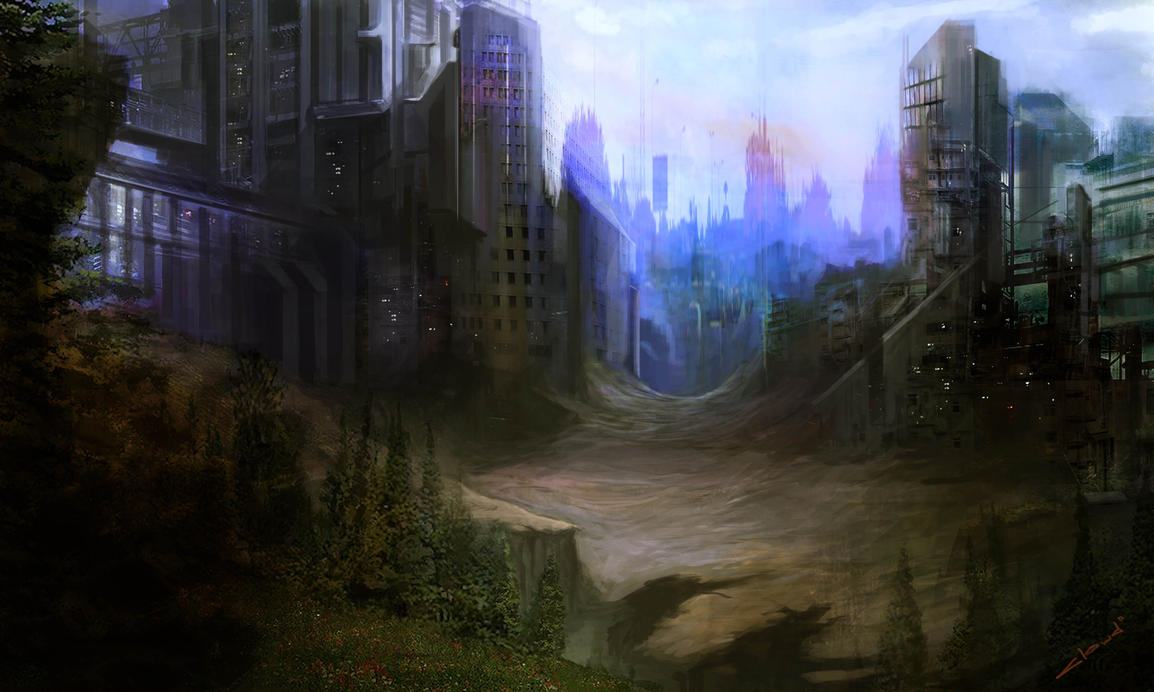
One target I had was to give an eerie and astmospheric appearance to my scene, which would imply some of the emotion involved with my character. Being in a post-apocalyptic, wasteland environment, solitary from the rest of society, I wanted it to have an abandoned and ill kept feel coupled with the possibility of a threat from the inclusion of the damage and rubble. Some of the inspiration for this was from video games set in a similar environment. Even though these were all rather action incorporated I was still able to get an understanding of the look and feel of the environments with decaying structures and cobbled together objects.

The game "Dear Esther" had a substantial effect on some of the choices I decided to make during production. Even though it is under the game genre it is more of an interactive experience, or more likely a visual book. By this I mean that the only control of the game is movement, you don't have to kill anything or find anything, you just have to move and experience the environment and atmosphere, accompanied by snippets of a monologue, helping you to understand the real story behind the remote island you find yourself on. Subtle objects and structures are littered around the environment with no clear reason other than what is explained to you during the sections of narration.


The visual quality as well was stunning and really helped to add to the experience, similar to my environment with the inclusion of textures improving it greatly. Lighting in it was something I wanted to replicate with sections of the game being set in a cave, illuminated with a blue glow from the luminescent elements, drawing you towards them.

The volume lights in my scene had the desired effect I wanted to acheive with them giving an eerie appearance, with strong shadows and dramatic light rays seeping through the windows. The hope was to have them engulf the scenes with light from the outside, whilst the inside light sources were limited or had a small effect, making the outside seem more appealing than the dreary and dark confines of the building.

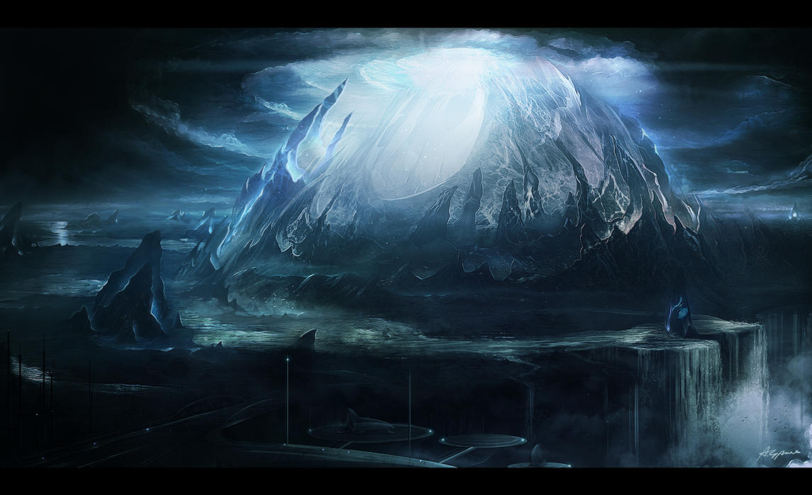
The one issue with my finished animation, recieved from feedback, is the lack of relevance when out of context. To someone who knows my character, the setting and overall effect I am trying to acheive with my environment it is obvious and easy to follow, however to someone unknowing, my animation is a tour of a dimly lit house with overturned furniture. There is no theme or iconic signature that defines my character like the bat for Batman or the S for Superman. My character doesn't have an underground lair where he keeps his costume and tech, nor a large ice structure in Antartica full of alien knowledge and devices. That to me is the only problem with my finished project. By trying to be against the grain and go in an alternative direction compared to other superhero characters, I have overlooked the need for something identifiable to symbolise my character. This still acheives my original intention of having a 'down to earth' character who doesn't have the flash base or tight outfit and is similar to my inspirations of games featuring a human character with heightened abilities, whilst not being deemed a superhero, still being able to do superhuman things.

Overall I am amazed with the quality of work I have produced for this project, in comparison to just a few years ago, making a poorly modelled, roughly textured, Mayan environment on 3Ds Max 2008 and still hope to expand my horizons with this and explore the possibilities available to me.

So without further ado, my finished animation:

Sunday, 29 January 2012

Visual Essay- 3D Animation Character Design


The main thing that appealed to me about animation are the characters themselves. Their exaggerated features that make their role in the animation instantly recognizable if something I find to be very effective in quickly giving a personality to a character in a short space of time. I can see similarities between this style and that of Pixar studios characters such as the Incredibles. 

Each character is recognizable for their individual physical appearance that in some cases is exaggerated to make it abundantly clear. This aspect of producing characters that are visually interesting and stylized in a caricaturist manner is something that has always appealed to me. One reason for this is their simplistic design that has a sense of humour to it, coupled with the animating style that complements the characters appearance with an exaggerated movement style that suits the visual style as a whole. For example, the Drown to Life animation has two characters, the small child character that has a scrawny body with a large head. His movement is very quick and nimble, which is something expected from a character of his style. Meanwhile the other character, the large, angry man has a much bulkier movement to him that reflects the character being big and overweight. However, even though both characters are very different in terms of their physical design, they both also move in a slapstick manner later in the animation with them bouncing around, fighting each other.
Fallen Art from Mata Leao on Vimeo.
This other animation also uses this exaggerated style for its characters, but also utilizes it for the environment and structures as well, with very elaborate contraptions and rickety tower buildings that would be impossible in reality. The emotion conveyed, much like the first one, is done very effectively without the used of words, but rather the facial expressions used. In the first animation they are all very exaggerated and comical and compliment the theme of it, however in 'Fallen Art', the second animation, each characters facial expression is much more detailed and realistic with slight sighs or audible cues narrating their emotion as well.

Friday, 27 January 2012

Typography Research


I also looked into types of fonts that would be suitable for use in my website.

Calibri
Arial
Times New Roman
Verdana
Courier New

The above fonts could all be used for the majority of the text used as they are all very simple and clear to read. Personally I would want a san-serif font for my site. The fonts above are all useable through Dreamweaver and I believe are standard fonts used on the web, making it simpler to apply them without having to produce a graphic that contains the font.

Dimitri Swank
Segoe Script
Today
Vivaldi
Criticized

For my header text however I would prefer something much more stylized that gives the page a visual appeal. The above examples are just a few styles that might be useable, having both handwritten designs along with vector graphic style text. The issue with using these however would be both that I would be required to make a image for a header rather than typing the text because of the compatibility issues as well as it defining a style for the page I must adhere to.

Another reason I would consider using an image graphic made in Photoshop rather than typing in the text would be the amount of modifying I can do to it. Whilst it is possible to adjust the majority of the details in Dreamweaver it is still rather limited in the positioning of the text and the page and the vertical spacing of each word. An example below I made in Photoshop captures the style I want to use on my website and was simple to make by using the variety of text editing tools and freedom to move it wherever within the page. As long as the image matched the dimensions of the header itself it was simple to move the text into a position where it would be placed correctly on the actually webpage.


Image File Types

As part of my research for designing my web portfolio I looked into image file types and optimization to get the best quality image whilst keeping a high quality. The image below is split into thirds showing three of the different file types, left to right: GIF; JPEG and PNG. The difference in quality is most noticeable with the GIF section of the image that has a lot of the images as blocks of a single colour that doesn't maintain the detail of the original image. This is mostly due to GIF being used for vector images that have limited amounts of block colour because of a GIF's limited colour palette. The JPEG and PNG sections both have a higher quality compared to the GIF, however I think for the majority of the images I put on my site I will use JPEG images because of file size.

File Sizes:
  • GIF:  515KB
  • JPEG: 170KB
  • PNG 24-bit: 1.04MB
 The large difference in file size between the JPEG and PNG files is substantial and with little noticeable difference it seems unnecessary to have such a large image file that would require more loading to access my website.

For the images I want to be of the highest possible quality, namely my gallery images, I might still use PNG as there is still a high amount of data lost when a JPEG is placed onto a website, making the quality reduced, whilst PNG's, being lossless, maintain the same quality and would be best for large detailed images.


Sunday, 22 January 2012

Website Wireframes

Some designs I have made for my online portfolio. Looking at different existing sites and examples I am planning to have a sidebar navigation layout with the main focus being on the rest of the page where the main content shall be.


 The last three designs feature moving tabs that extend when hovered over to make it clear which one is selected. This would be something I would want to achieve as I believes it gives it a professional appearance, however the research I have done so far into the effect has been unsuccessful in finding out any methods to produce it, other then some similar examples utilizing Javascript.
I still like the rest of its simplistic design with the navigation located where it is along with the header aligned to the right.


Thursday, 19 January 2012

Interactive Moodboard

This moodboard is for my interactive design project to explore some of the different graphic styles I am interested in. In particular I am keen on science fiction and fantasy genres, which could be incorporated into the design, however looking at some more basic graphic images and styles such as pixel art would be more suited to the task.
The fonts I considered all had some character to them and some examples such as the 'cubic' font in the lower right corner might be effective as it is a simple design with straight edges that could look professional for header text.
I also looked at some other work including sketches and concept art, which is one style that could be used, giving it a hand drawn feel, however this would be very complex and might not work well if done poorly.