Showing posts with label Interactive. Show all posts

Friday, 27 January 2012

Typography Research


I also looked into types of fonts that would be suitable for use in my website.

Calibri
Arial
Times New Roman
Verdana
Courier New

The above fonts could all be used for the majority of the text used as they are all very simple and clear to read. Personally I would want a san-serif font for my site. The fonts above are all useable through Dreamweaver and I believe are standard fonts used on the web, making it simpler to apply them without having to produce a graphic that contains the font.

Dimitri Swank
Segoe Script
Today
Vivaldi
Criticized

For my header text however I would prefer something much more stylized that gives the page a visual appeal. The above examples are just a few styles that might be useable, having both handwritten designs along with vector graphic style text. The issue with using these however would be both that I would be required to make a image for a header rather than typing the text because of the compatibility issues as well as it defining a style for the page I must adhere to.

Another reason I would consider using an image graphic made in Photoshop rather than typing in the text would be the amount of modifying I can do to it. Whilst it is possible to adjust the majority of the details in Dreamweaver it is still rather limited in the positioning of the text and the page and the vertical spacing of each word. An example below I made in Photoshop captures the style I want to use on my website and was simple to make by using the variety of text editing tools and freedom to move it wherever within the page. As long as the image matched the dimensions of the header itself it was simple to move the text into a position where it would be placed correctly on the actually webpage.


Image File Types

As part of my research for designing my web portfolio I looked into image file types and optimization to get the best quality image whilst keeping a high quality. The image below is split into thirds showing three of the different file types, left to right: GIF; JPEG and PNG. The difference in quality is most noticeable with the GIF section of the image that has a lot of the images as blocks of a single colour that doesn't maintain the detail of the original image. This is mostly due to GIF being used for vector images that have limited amounts of block colour because of a GIF's limited colour palette. The JPEG and PNG sections both have a higher quality compared to the GIF, however I think for the majority of the images I put on my site I will use JPEG images because of file size.

File Sizes:
  • GIF:  515KB
  • JPEG: 170KB
  • PNG 24-bit: 1.04MB
 The large difference in file size between the JPEG and PNG files is substantial and with little noticeable difference it seems unnecessary to have such a large image file that would require more loading to access my website.

For the images I want to be of the highest possible quality, namely my gallery images, I might still use PNG as there is still a high amount of data lost when a JPEG is placed onto a website, making the quality reduced, whilst PNG's, being lossless, maintain the same quality and would be best for large detailed images.


Sunday, 22 January 2012

Website Wireframes

Some designs I have made for my online portfolio. Looking at different existing sites and examples I am planning to have a sidebar navigation layout with the main focus being on the rest of the page where the main content shall be.


 The last three designs feature moving tabs that extend when hovered over to make it clear which one is selected. This would be something I would want to achieve as I believes it gives it a professional appearance, however the research I have done so far into the effect has been unsuccessful in finding out any methods to produce it, other then some similar examples utilizing Javascript.
I still like the rest of its simplistic design with the navigation located where it is along with the header aligned to the right.


Thursday, 19 January 2012

Interactive Moodboard

This moodboard is for my interactive design project to explore some of the different graphic styles I am interested in. In particular I am keen on science fiction and fantasy genres, which could be incorporated into the design, however looking at some more basic graphic images and styles such as pixel art would be more suited to the task.
The fonts I considered all had some character to them and some examples such as the 'cubic' font in the lower right corner might be effective as it is a simple design with straight edges that could look professional for header text.
I also looked at some other work including sketches and concept art, which is one style that could be used, giving it a hand drawn feel, however this would be very complex and might not work well if done poorly.

Saturday, 5 November 2011

Interaction Brief and Thoughts

Task: Create a interactive space using digital stills and HTML/CSS which visitors can explore.

After looking at this brief my first step was to research existing examples of this medium, particularly for the way navigation had been incorporated and the objective of the whole interactive space.
Some examples like the ones below taken from Youtube, had a video setting the situation followed by a multiple choice option that redirected to the appropriate video down that selected path with it, depending on the storyline, ending in success or failure leaving the other routes open to attempt.


I have decided to base my interactive space on a 'dungeon crawler' type experience with the end target being to reach the treasure situated within the environment. All of my digital images will be made in Adobe Illustrator and Photoshop as I believe this will give me the most freedom to produce a suitable looking environment that matches my intentions. I looked at a variety of games based in a dungeon environment as well as things that could act as puzzles or obstacles throughout the adventure as well as researching old text based adventure games such as Zork that had simple typing interfaces to explore an imaginary environment with a lot of options being accounted for.

Dungeon and Dragons and was also something I considered when designing my dungeon environment as I wanted to add an element of chance into my adventure, however could not find a possible solution to this with my knowledge of HTML.

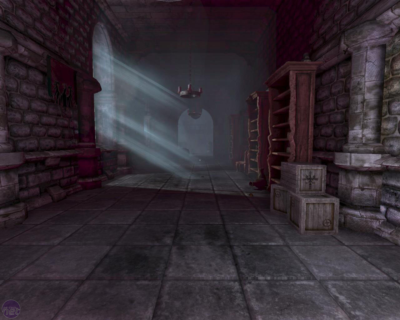
Amnesia: The Dark Descent was one game I looked at as a features a variety of puzzles and challenges that I thought I could incorporate as well as having a dark castle setting that I wanted to base my digital stills on.


http://i.telegraph.co.uk/multimedia/archive/01713/amnesia-dark5_1713819c.jpg
http://screenshots.en.sftcdn.net/en/scrn/133000/133288/amnesia-the-dark-descent-36.jpg
http://images.bit-tech.net/content_images/2010/06/amnesia-the-dark-descent-hands-on-preview/amnesia-descent-preview-07.jpg
 Another game I looked at was a turn-based game called Dungeons of Dredmor. The reason I looked at this was to get an idea of a dungeon type environment in a low graphic format. Also I looked at this because the turn based element of it meant it was easy to get an understanding of options that could be given to a user such as movement, attacking or using an item.

http://pcmedia.ign.com/pc/image/article/118/1184857/dungeons-of-dredmor-20110728061011202_640w.jpg
http://cdn.gaslampgames.com/blog/wp-content/uploads/2011/04/dred_shot24.jpg

Tuesday, 1 November 2011